FortressPoint Security Solutions
From a noisy brochure site to a credibility engine.
A complete redesign that swapped aggressive, cluttered marketing for a calm, credible experience — built to win the trust of security buyers who value transparency over hype.
- Enquiry form fields
- 13 → 5Enquiry form fields
- Less form friction
- 62%Less form friction
- Clear primary CTA
- 1Clear primary CTA
- Accessible by design
- WCAG AAAccessible by design
See the difference for yourself
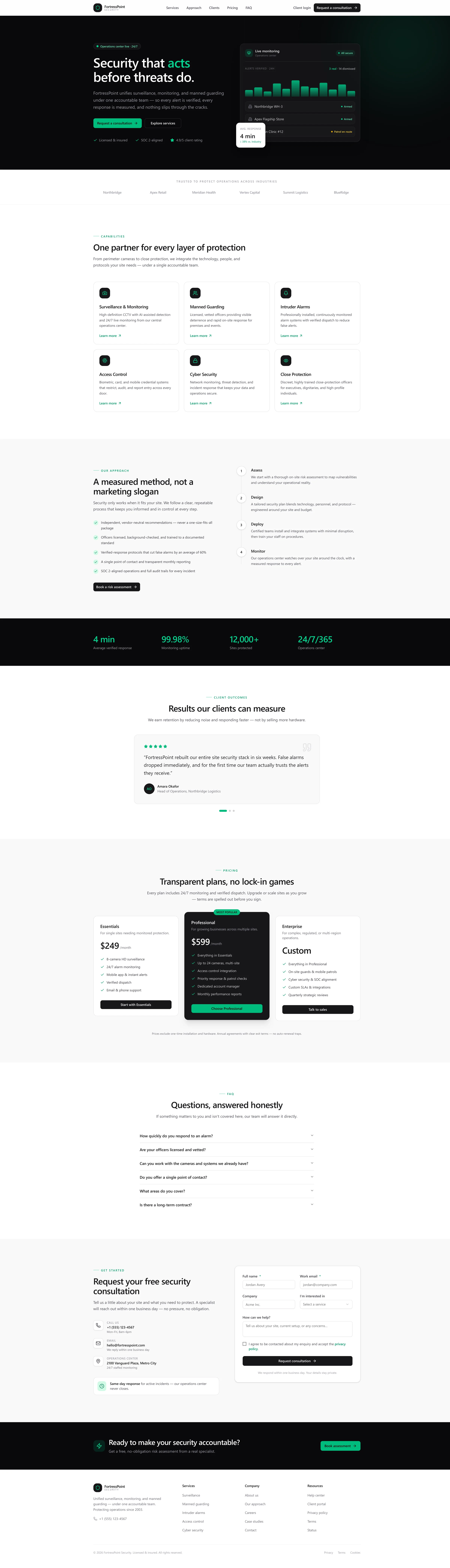
Scroll within the frame to explore the full page · toggle to compare
What was holding them back
FortressPoint sells high-stakes, high-trust services — yet their website leaned on the opposite signals. Countdown banners, “Limited time: 20% off” offers and a “Voted #1” badge created urgency where buyers wanted reassurance.
The interface itself worked against them: a heavy dark-red palette, competing calls-to-action, scrolling stat marquees and a 13-field enquiry form that buried visitors before they could ask a simple question. The hero — “Comprehensive Security Solutions for the Modern Enterprise” — said a lot and proved very little.
The result was a site that looked busy but felt generic, making it hard for serious commercial clients to understand what FortressPoint actually does, or why they should trust them with their premises.
- Aggressive urgency tactics that undermine trust
- Cluttered dark-red UI with competing calls-to-action
- A 13-field enquiry form that buries the visitor
- Vague, generic messaging with little proof
What we changed
We repositioned the brand around the one thing security buyers care about most: accountability. The new message — “Security that acts before threats do.” — leads with a measured, honest tone that replaces hype with proof.
Visually, we moved to a confident near-black and emerald system with generous whitespace and a clear hierarchy. A live “operations center” hero widget puts verified alerts and a 4-minute average response time front and centre — showing capability instead of claiming it.
We restructured six services into a scannable capabilities grid, distilled the process into four clear steps (Assess → Design → Deploy → Monitor), made pricing transparent with no lock-in, and replaced the 13-field form with a focused five-field consultation request.
- Calm, confident dark + emerald design with clear hierarchy
- A live operations-center widget that shows proof, not promises
- A focused five-field consultation request
- Transparent pricing and an honest, measured tone
This is a concept redesign created to demonstrate our approach. Comparison figures reflect changes between the two designs shown.
Want a website that earns this kind of trust?
Start with a free, no-obligation audit of your current site — and a clear plan to modernise it.
Book a Free Website Audit